── Attaching packages ─────────────────────────────────────── tidyverse 1.3.2 ──
✔ ggplot2 3.4.0     ✔ purrr   1.0.1
✔ tibble  3.1.8     ✔ dplyr   1.1.0
✔ tidyr   1.3.0     ✔ stringr 1.5.0
✔ readr   2.1.3     ✔ forcats 1.0.0
── Conflicts ────────────────────────────────────────── tidyverse_conflicts() ──
✖ dplyr::filter() masks stats::filter()
✖ dplyr::lag()    masks stats::lag()
Attaching package: 'lubridate'

The following objects are masked from 'package:base':

    date, intersect, setdiff, union
library (readxl)library (ggpubr)library (showtext)
Loading required package: sysfonts
Loading required package: showtextdb
図の詳細設定
showtext パッケージを使って、システムフォントを使えるようにします。 使用可能なフォントは次のように調べます。
#! eval: false font_files () |> as_tibble ()
# A tibble: 720 × 6
   path                                       file  family face  version ps_name
   <chr>                                      <chr> <chr>  <chr> <chr>   <chr>
 1 /home/gnishihara/.local/share/fonts/Unkno… Font… Fonti… Bold… "1.000" Fontin…
 2 /home/gnishihara/.local/share/fonts/Unkno… Font… Fonti… Ital… "1.000" Fontin…
 3 /home/gnishihara/.local/share/fonts/Unkno… Font… Fonti… Regu… "1.000" Fontin…
 4 /home/gnishihara/.local/share/fonts/Unkno… Font… Fonti… Smal… "1.000" Fontin…
 5 /home/gnishihara/.local/share/fonts/Unkno… EB_G… EB Ga… Ital… "Versi… EBGara…
 6 /home/gnishihara/.local/share/fonts/Unkno… EB_G… EB Ga… Regu… "Versi… EBGara…
 7 /home/gnishihara/.local/share/fonts/Unkno… Font… Fonti… Smal… "Versi… Fontin…
 8 /home/gnishihara/.local/share/fonts/Unkno… Font… Fontin Bold  "Versi… Fontin…
 9 /home/gnishihara/.local/share/fonts/Unkno… Font… Fontin Ital… "Versi… Fontin…
10 /home/gnishihara/.local/share/fonts/Unkno… Font… Fontin Regu… "Versi… Fontin…
# … with 710 more rows
Google の Noto シリーズのフォントを使いたいので、filter() にかけます。
font_files () |> as_tibble () |> filter (str_detect (ps_name, "NotoSansCJK|NotoSansSymbol" )) |> select (file, face, ps_name)
# A tibble: 17 × 3
   file                           face    ps_name
   <chr>                          <chr>   <chr>
 1 NotoSansCJKjp-Black.otf        Regular NotoSansCJKjp-Black
 2 NotoSansCJKjp-Bold.otf         Regular NotoSansCJKjp-Bold
 3 NotoSansCJKjp-DemiLight.otf    Regular NotoSansCJKjp-DemiLight
 4 NotoSansCJKjp-Light.otf        Regular NotoSansCJKjp-Light
 5 NotoSansCJKjp-Medium.otf       Regular NotoSansCJKjp-Medium
 6 NotoSansCJKjp-Regular.otf      Regular NotoSansCJKjp-Regular
 7 NotoSansCJKjp-Thin.otf         Regular NotoSansCJKjp-Thin
 8 NotoSansSymbols-Black.ttf      Regular NotoSansSymbols-Black
 9 NotoSansSymbols-Bold.ttf       Bold    NotoSansSymbols-Bold
10 NotoSansSymbols-ExtraBold.ttf  Regular NotoSansSymbols-ExtraBold
11 NotoSansSymbols-ExtraLight.ttf Regular NotoSansSymbols-ExtraLight
12 NotoSansSymbols-Light.ttf      Regular NotoSansSymbols-Light
13 NotoSansSymbols-Medium.ttf     Regular NotoSansSymbols-Medium
14 NotoSansSymbols-Regular.ttf    Regular NotoSansSymbols-Regular
15 NotoSansSymbols-SemiBold.ttf   Regular NotoSansSymbols-SemiBold
16 NotoSansSymbols-Thin.ttf       Regular NotoSansSymbols-Thin
17 NotoSansSymbols2-Regular.ttf   Regular NotoSansSymbols2-Regular
フォントファイルのファイル名は file 変数にあります。 その変数を使って、font_add() 関数で用意します。
font_add (family = "notosans" , regular = "NotoSansCJKjp-Regular.otf" ,bold = "NotoSansCJKjp-Black.otf" ,symbol = "NotoSansSymbols-Regular.ttf" )
図のデフォルトテーマをここで設定します。 base_size はフォントの大きさ。 base_family は font_add() で定義した family です。
theme_gray (base_size = 10 , base_family = "notosans" ) |> theme_set ()showtext_auto ()
論文用のテーマは ggpubr パッケージの theme_pubr() をおすすめします。
theme_pubr (base_size = 10 , base_family = "notosans" ) |> theme_set ()showtext_auto ()
ggplot2 について
ggplot2 の関数は + でつなげるggplot() はベースレイヤーgeom_*() はプロットレイヤーscales_*() でエステティク (aesthetics) を調整theme() や theme_() で書式を調整facet_wrap() や facet_grid() は多変量データのプロットのパネル分け
Aesthetics (エステティク)とは
色・透明度
color:点と線の色fill:面の色alpha:透明度(0 – 1 の値)
大きさ・形状
size:点と文字の大きさ、線の太さshape:点の形linetype:線の種類
座標、始点・終点
x, yxmin, yminxend, yend
geom の種類
散布図
geom_point()geom_jitter()
折れ線グラフ
geom_path()geom_line()geom_step()
面グラフ * geom_ribbon() * geom_area() * geom_polygon()
ヒートマップ・コンター図 * geom_tile() * geom_raster() * geom_rect() * geom_contour()
エラーバー * geom_error() * geom_linerange() * geom_pointrange() * geom_crossbar()
geom の種類
曲線など
geom_smooth()geom_curve()geom_segment()geom_abline()geom_hline()geom_vline()
文字列
ヒストグラム・密度曲線 * geom_histogram() * geom_freqpoly() * geom_density() * geom_bin2d() * geom_hex() * geom_dotplot()
棒グラフ・箱ひげ図 * geom_bar() * geom_col() * geom_boxplot() * geom_violin()
ggplot2 の付属パッケージ研究室が使っているパッケージ
ggpubr: theme_pubr(), ggarrange()ggrepel: geom_text_repel()lemon: facet_rep_grid(), facet_rep_wrap()showtext: システムフォントの埋め込み
ggplot2 extensions
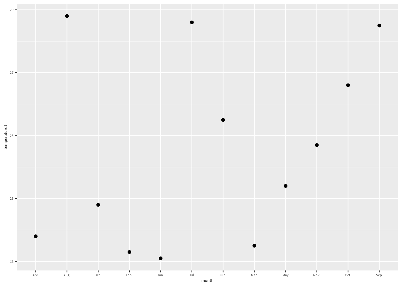
データを読み込んだら、可視化しよう
= "Table 2.xlsx" = c ("month" , "temperature1" , "sd1" , "empty" ,"temperature2" , "sd2" )= read_excel (filename, sheet = 1 , skip = 2 , col_name = col_names)
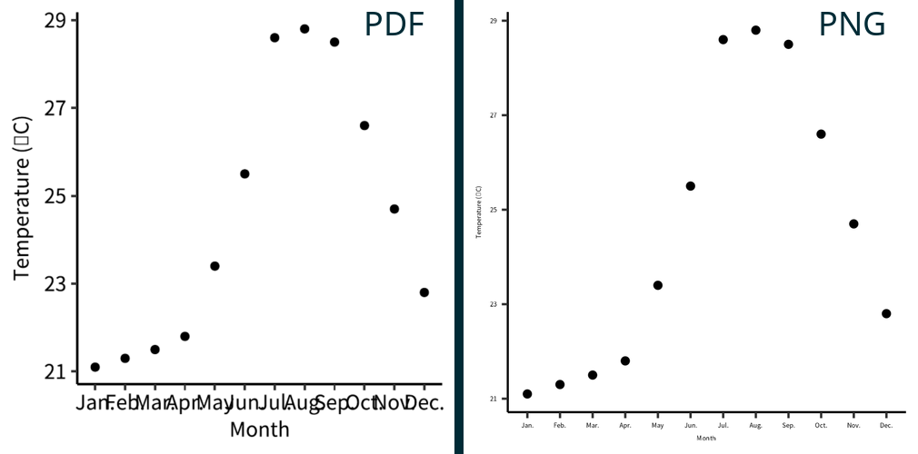
ggplot (exceldata) + geom_point (aes (x = month, y = temperature1))
横軸の順序がおかしいですね。軸タイトルも変えたほうがいいですね。
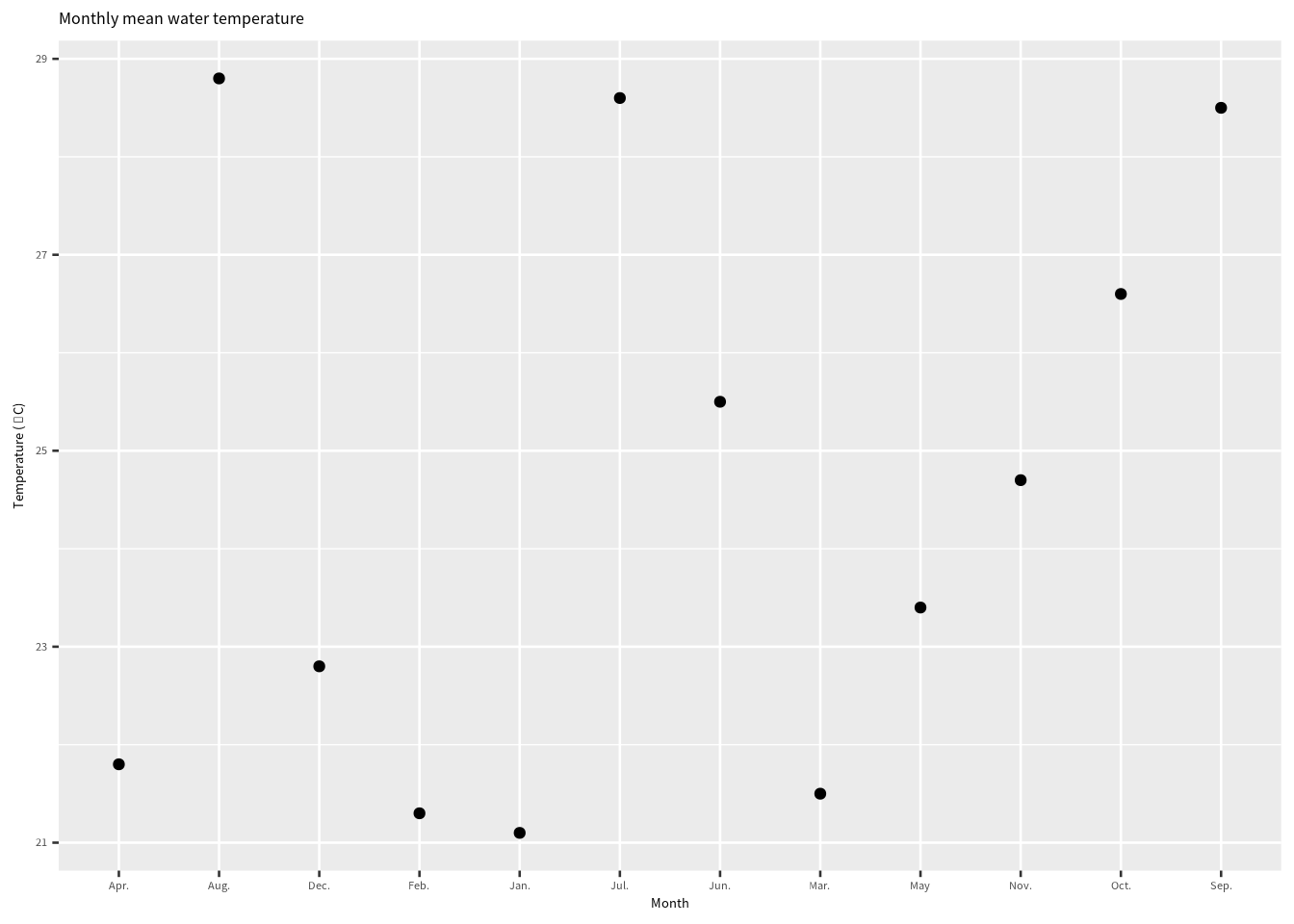
軸タイトルの関数
軸タイトルや図のタイトルは labs() 関数でします。
= "Month" = "'Temperature ('*degree*'C)'" # plotmath expression see ?plotmath ggplot (exceldata) + geom_point (aes (x = month, y = temperature1)) + labs (x = xlabel, y = parse (text = ylabel),title = "Monthly mean water temperature" )
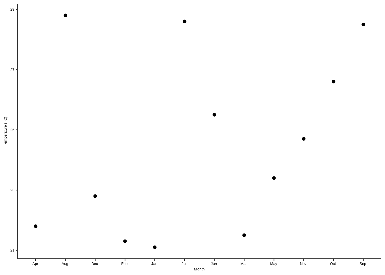
論文用に変える
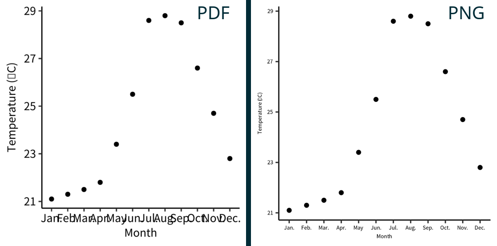
学術論文に記載する図の場合、図から余計なかざりを外します。 研究室では ggpubr の theme_pubr() 関数を使っています。
= "Month" = "'Temperature ('*degree*'C)'" # plotmath expression see ?plotmath ggplot (exceldata) + geom_point (aes (x = month, y = temperature1)) + labs (x = parse (text = xlabel), y = parse (text = ylabel)) + theme_pubr (base_size = 10 )
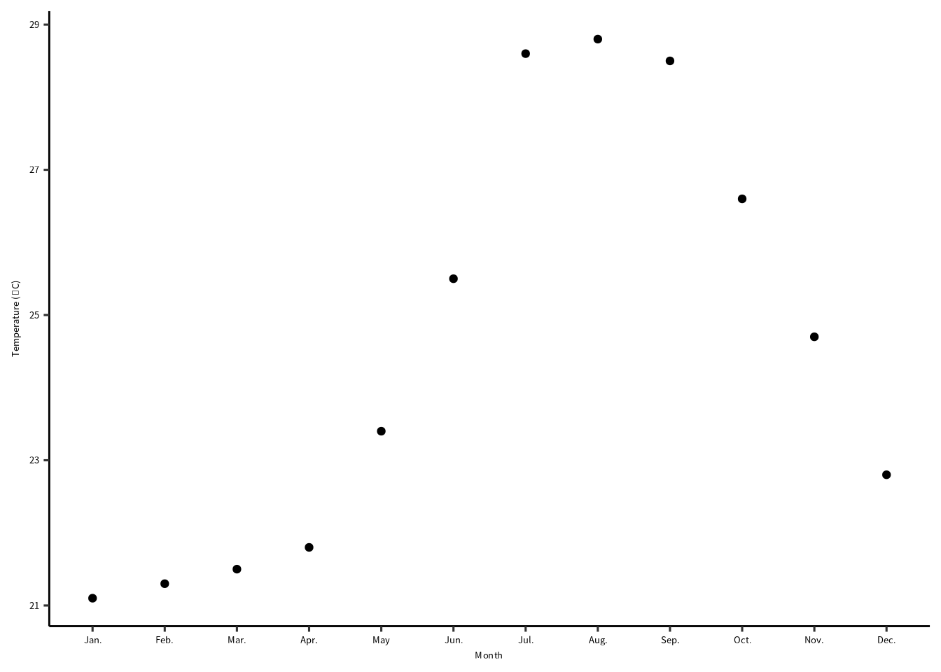
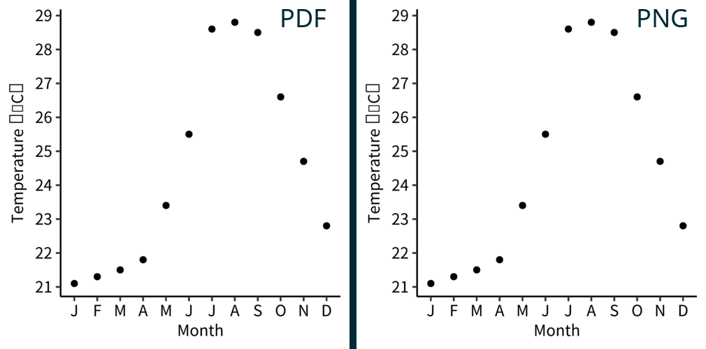
月の順序をなおす
もう気づいたと思いますが、横軸の月の順序が間違っています。 factor() で、month 変数を整えます。
# element_text() size is in points (pt) # 1 pt = 0.35 mm = "Month" = "'Temperature ('*degree*'C)'" # plotmath expression see ?plotmath = month.abb= str_c (levels, ifelse (levels == "May" , "" , "." ))|> mutate (month = factor (month, levels = levels)) |> ggplot () + geom_point (aes (x = month, y = temperature1)) + labs (x = parse (text = xlabel), y = parse (text = ylabel)) + theme_pubr (base_family = "notosans" ) + theme (text = element_text (size = 10 ))
Linking to ImageMagick 6.9.11.60
Enabled features: fontconfig, freetype, fftw, heic, lcms, pango, webp, x11
Disabled features: cairo, ghostscript, raw, rsvg
図を保存する
図は PDF と PNG 形式で保存しましょう。
PDFファイル ggsave() は最後の表示した図を書き出しします。 width と height を指定したら必ず単位も指定しましょう (units = "mm")。 PDFファイルにシステムフォントを埋め込むなら、device = cairo_pdfも渡しましょう。
= list (width = 80 , height = 80 ) # 図の縦横幅 = "temperature_plot.pdf" ggsave (pdffile, width = wh$ width, height = wh$ height, units = "mm" , device = cairo_pdf)
PNGファイル 直接PNGファイルに保存する場合は、画像の解像度 (dpi = 300) も必要です。
= "temperature_plot.png" ggsave (pngfile, width = wh$ width, height = wh$ height, units = "mm" , dpi = 300 )
保存の結果
wh = list(width = 80, height = 80) は同じだが、図は似ていません。モニターでみたとき、PDF の解像度は 96 です。つまり、dpi = 300 のPNGファイルはPDFの約 3 倍の大きさです。
図のフォントを拡大して、PNGファイルを修正する
= 300 = DPI / 96 |> mutate (month = factor (month, levels = levels)) |> ggplot () + geom_point (aes (x = month, y = temperature1)) + labs (x = parse (text = xlabel), y = parse (text = ylabel)) + theme_pubr (base_family = "notosans" ) + theme (text = element_text (size = 10 * scale))= "temperature_plot.png" = list (width = 80 , height = 80 )ggsave (pngfile, width = wh$ width, height = wh$ height, units = "mm" , dpi = DPI)
研究室のワークフロー
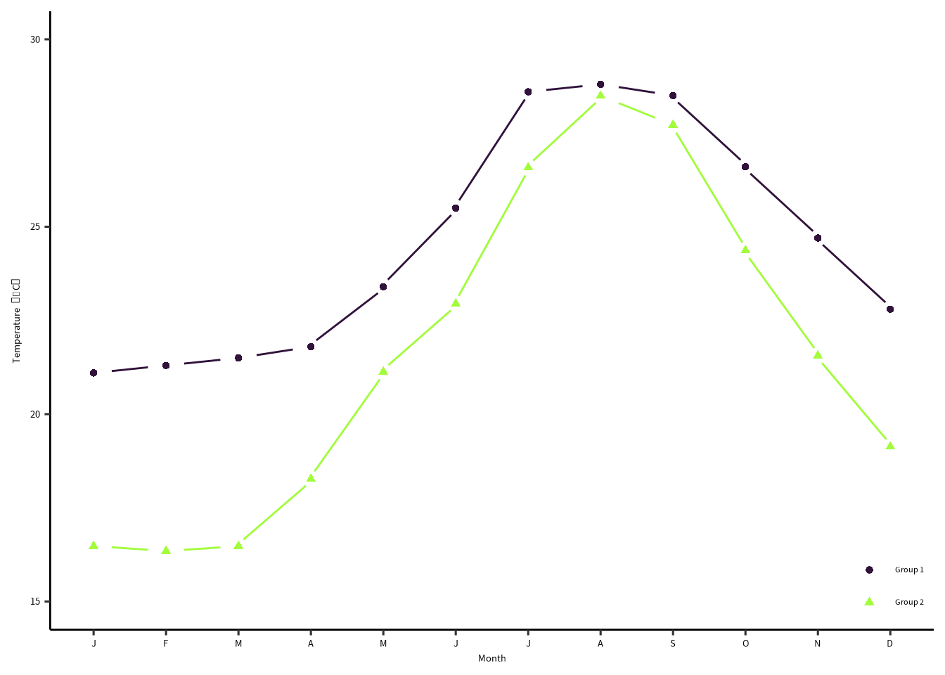
PNGファイルのDPIをいじるのが面倒なので、PDFをPNGに変換するのが楽です。 月の頭文字をチックラベルにします。さらに、lemon パッケージの geom_pointline()を使ってみました。
Attaching package: 'lemon'
The following object is masked from 'package:purrr':

    %||%
= "Month" = "'Temperature'~(degree*C)" # plotmath expression see ?plotmath = month.abb= str_c (levels, ifelse (levels == "May" , "" , "." ))= str_sub (month.abb, 1 , 1 )# 図の結果は plot1 にいれます。 = exceldata |> mutate (month = factor (month, levels = levels)) |> ggplot () + geom_point (aes (x = month, y = temperature1)) + scale_x_discrete (name = xlabel, labels = labels) + scale_y_continuous (name = parse (text = ylabel), breaks = seq (21 , 29 , by = 1 )) + theme_pubr (base_family = "notosans" ) + theme (text = element_text (size = 10 ))
まず、PDFファイルを保存します。システムフォントをPDFファイルに入れるためには device = cairo_pdf を渡します。
= list (width = 80 , height = 80 ) # 図の縦横幅 = "temperature_plot.pdf" ggsave (pdffile, width = wh$ width, height = wh$ height, units = "mm" , device = cairo_pdf)
ImageMagick のAPIを使って、PDFをPNGに変換します。 この方法だと、DPIのややこしい変換は不要です。
つぎに magick パッケージを読み込みます。
library (magick) # imagemagick パッケージ
つづいて、PDF ファイルを 600 DPI で読み込む。
= image_read_pdf (pdffile, density = 600 )
PDFファイルをPNGファイルに書き出す。
|> image_write (pngfile)
保存の結果
このとき、フォントサイズは 10 pt にしました:theme(text = element_text(size = 10))。
データを追加してプロット
= "Month" = "'Temperature'~(degree*C)" # plotmath expression see ?plotmath = month.abb= str_c (levels, ifelse (levels == "May" , "" , "." ))= str_sub (month.abb, 1 , 1 )|> mutate (month = factor (month, levels = levels)) |> ggplot () + geom_pointline (aes (x = month, y = temperature1, color = "Group 1" , shape = "Group 1" , group = 1 )) + geom_pointline (aes (x = month, y = temperature2, color = "Group 2" , shape = "Group 2" , group = 1 )) + scale_x_discrete (name = xlabel, labels = labels) + scale_y_continuous (name = parse (text = ylabel), breaks = seq (15 , 30 , by = 5 ), limits = c (15 , 30 )) + scale_color_viridis_d ("" , option = "turbo" , begin = 0 , end = 0.5 ) + scale_shape_discrete ("" ) + theme_pubr (base_family = "notosans" ) + theme (text = element_text (size = 10 ),legend.position = c (1 , 0 ),legend.justification = c (1 , 0 ),legend.background = element_blank (),legend.title = element_blank ())
]
複数パネルのプロット
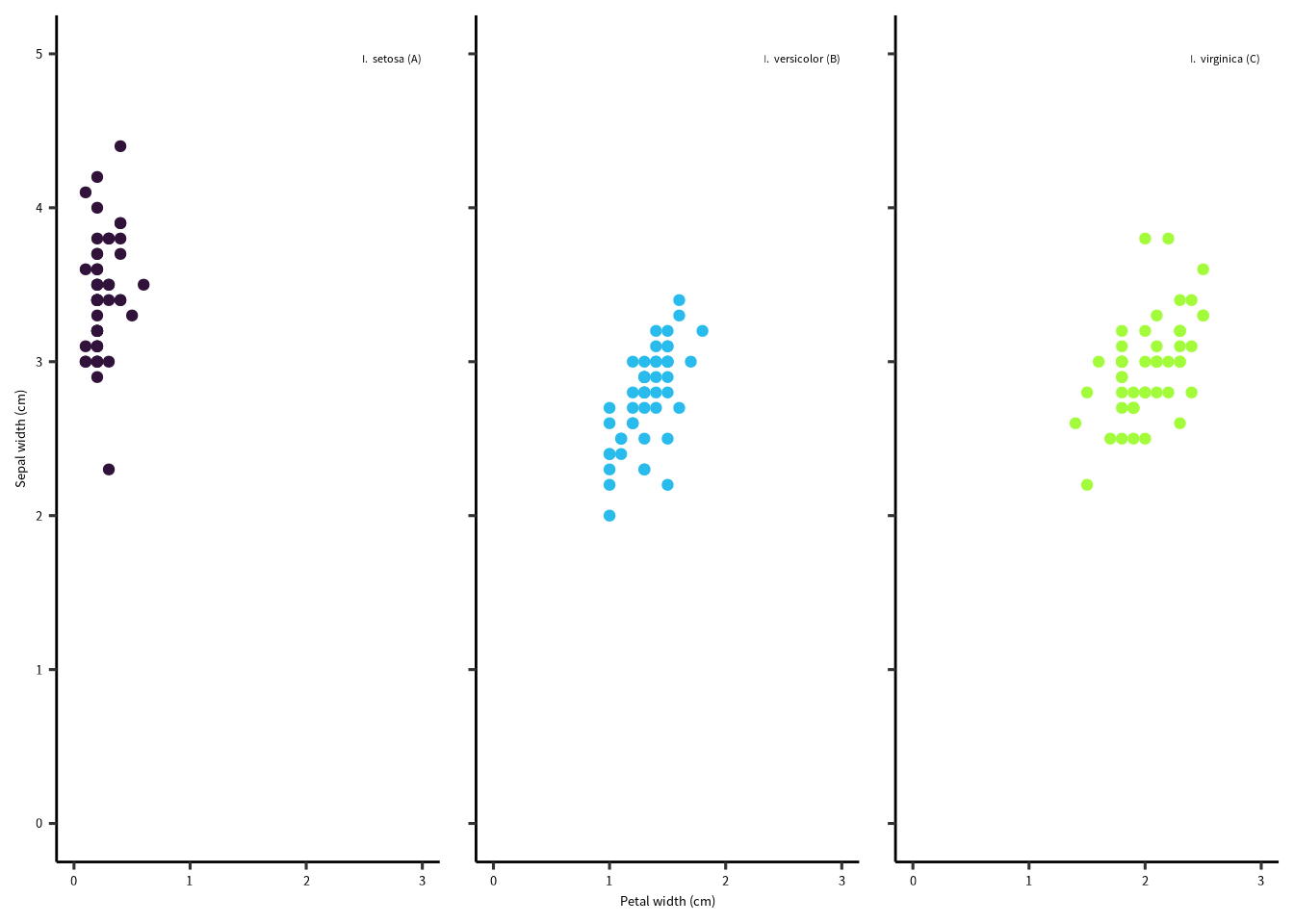
= "Petal width (cm)" = "Sepal width (cm)" |> group_nest (Species) |> mutate (L = c ("A" , "B" , "C" )) |> mutate (Species = sprintf ("italic('I.')~italic('%s')~'(%s)'" , Species, L)) |> unnest (data) |> ggplot () + geom_point (aes (x = Petal.Width, y = Sepal.Width, color = Species)) + geom_text (aes (x = 3 , y = 5 , label = Species), parse = TRUE , vjust = 1 , hjust = 1 ,family = "notosans" , size = 3 , check_overlap = TRUE ) + scale_x_continuous (name = xlabel, breaks = seq (0 , 3 ), limits = c (0 , 3 )) + scale_y_continuous (name = ylabel, breaks = seq (0 , 5 ), limits = c (0 , 5 )) + scale_color_viridis_d ("" , option = "turbo" , begin = 0 , end = 0.5 , labels = scales:: parse_format ()) + guides (color = "none" ) + facet_rep_grid (cols = vars (Species)) + theme_pubr (base_family = "notosans" ) + theme (text = element_text (size = 10 ),strip.background = element_blank (),strip.text = element_blank ())
複数プロットの結合
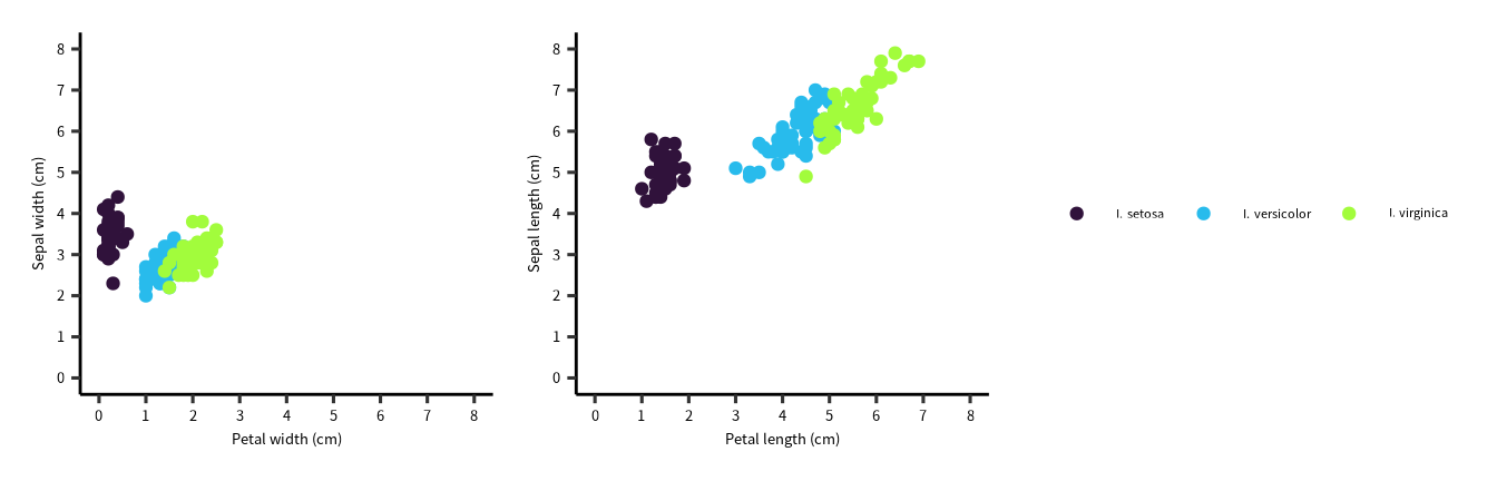
= "Petal width (cm)" = "Sepal width (cm)" = "Petal length (cm)" = "Sepal length (cm)" = iris |> mutate (Species = sprintf ("italic('I.')~italic('%s')" , Species))
= ggplot (iris2) + geom_point (aes (x = Petal.Width, y = Sepal.Width, color = Species)) + scale_x_continuous (name = xlabel1, breaks = seq (0 , 8 ), limits = c (0 , 8 )) + scale_y_continuous (name = ylabel1, breaks = seq (0 , 8 ), limits = c (0 , 8 )) + scale_color_viridis_d ("" , option = "turbo" , begin = 0 , end = 0.5 , labels = scales:: parse_format ()) + theme_pubr (base_family = "notosans" ) + theme (text = element_text (size = 10 ))
= ggplot (iris2) + geom_point (aes (x = Petal.Length, y = Sepal.Length, color = Species)) + scale_x_continuous (name = xlabel2, breaks = seq (0 , 8 ), limits = c (0 , 8 )) + scale_y_continuous (name = ylabel2, breaks = seq (0 , 8 ), limits = c (0 , 8 )) + scale_color_viridis_d ("" , option = "turbo" , begin = 0 , end = 0.5 , labels = scales:: parse_format ()) + theme_pubr (base_family = "notosans" ) + theme (text = element_text (size = 10 ))
複数プロットの結合の結果
+ plot2 + plot_layout (ncol = 2 , nrow = 1 , guides = "collect" )
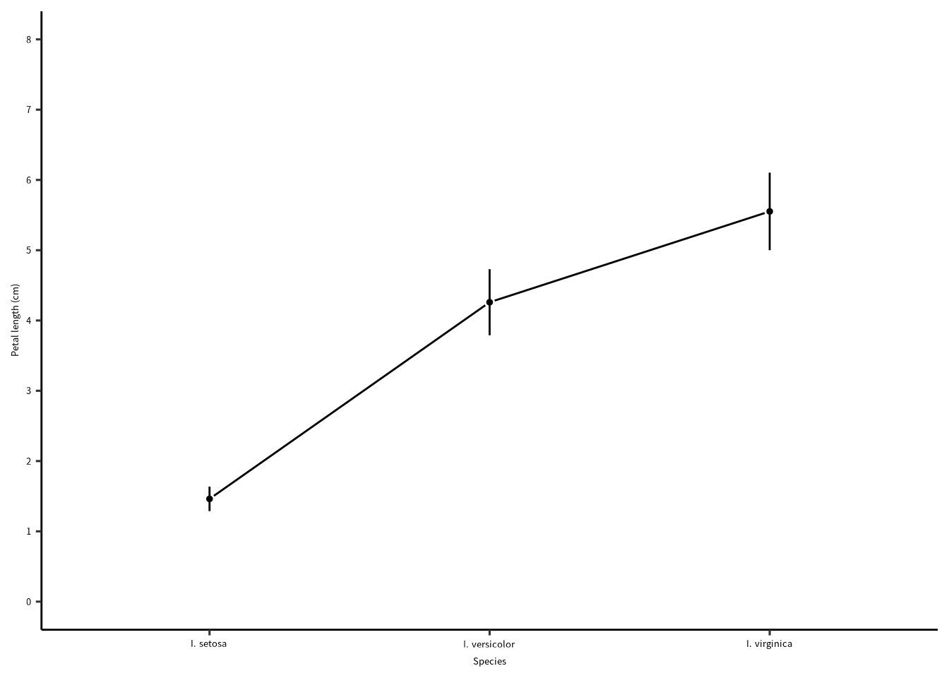
線と点(説明変数は離散型変数の場合)
= "Petal length (cm)" |> group_by (Species) |> summarise (PL = mean (Petal.Length),sd = sd (Petal.Length)) |> mutate (lower = PL - sd,upper = PL + sd) |> ggplot () + geom_line (aes (x = Species, y = PL, group = 1 )) + geom_point (aes (x = Species, y = PL), size = 2 , color = "white" ) + geom_point (aes (x = Species, y = PL), size = 1 ) + geom_errorbar (aes (x = Species, ymin = lower, ymax = upper),width = 0.0 ) + scale_x_discrete (name = "Species" , labels = scales:: parse_format ()) + scale_y_continuous (name = ylabel, breaks = seq (0 , 8 ), limits = c (0 , 8 )) + theme_pubr (base_family = "notosans" ) + theme (text = element_text (size = 10 ))
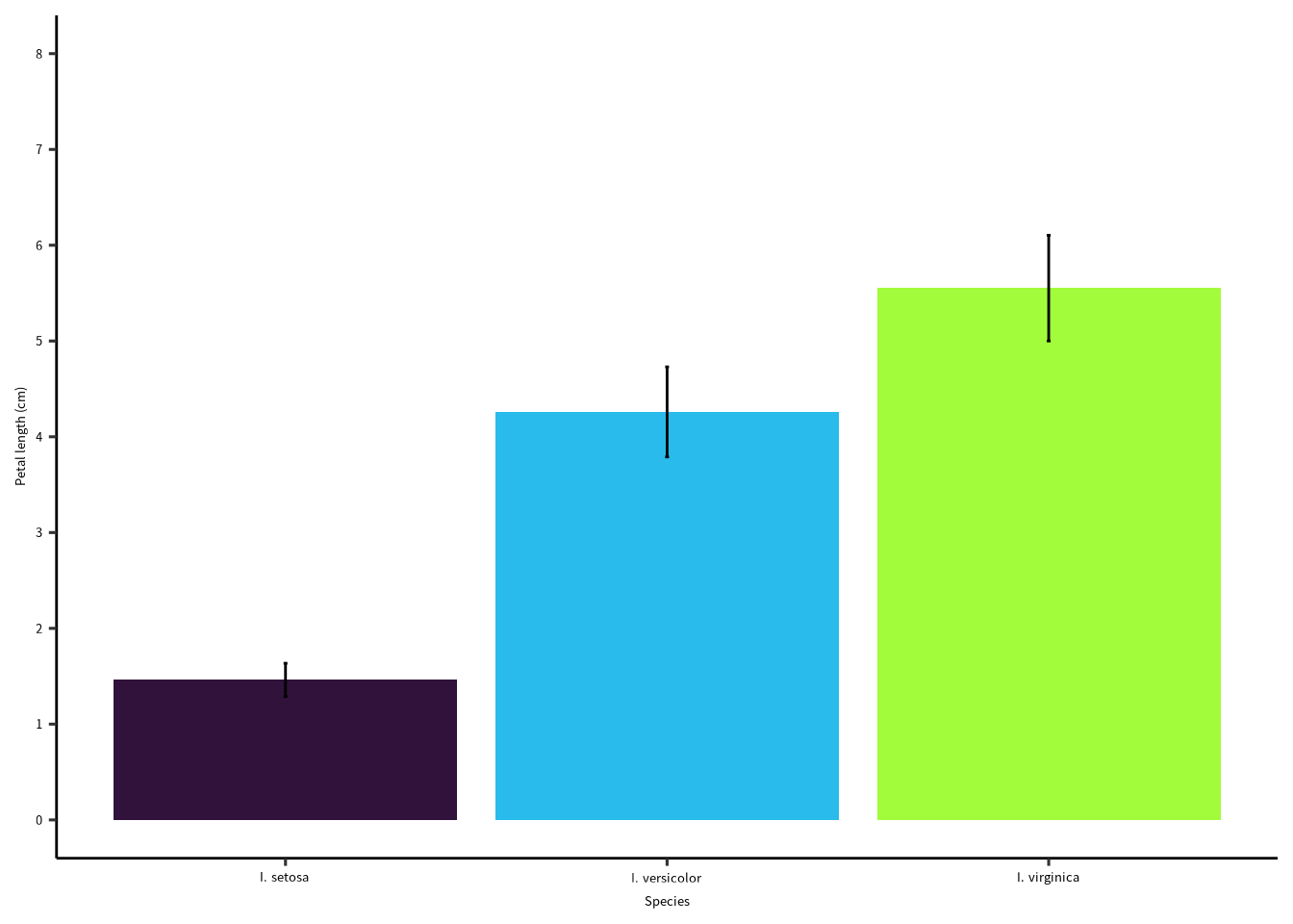
ボーグラフ
= "Petal length (cm)" |> group_by (Species) |> summarise (PL = mean (Petal.Length),sd = sd (Petal.Length)) |> mutate (lower = PL - sd,upper = PL + sd) |> ggplot () + geom_col (aes (x = Species, y = PL, fill = Species)) + geom_errorbar (aes (x = Species, ymin = lower, ymax = upper),width = 0.01 ) + scale_x_discrete (name = "Species" , labels = scales:: parse_format ()) + scale_y_continuous (name = ylabel, breaks = seq (0 , 8 ), limits = c (0 , 8 )) + scale_fill_viridis_d ("" , option = "turbo" , begin = 0 , end = 0.5 , labels = scales:: parse_format ()) + guides (fill = "none" ) + theme_pubr (base_family = "notosans" ) + theme (text = element_text (size = 10 ))
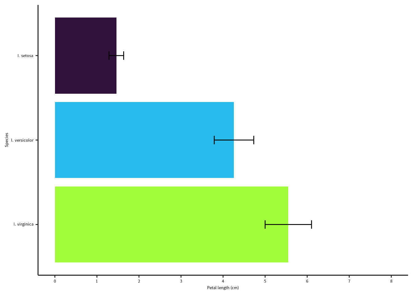
ボーグラフ(横向き・並び替える)
= "Petal length (cm)" |> group_by (Species) |> summarise (PL = mean (Petal.Length),sd = sd (Petal.Length)) |> mutate (lower = PL - sd,upper = PL + sd) |> ggplot (aes (x = fct_reorder (Species, PL, .desc = T))) + geom_col (aes (y = PL, fill = Species)) + geom_errorbar (aes (ymin = lower, ymax = upper),width = 0.1 ) + scale_x_discrete (name = "Species" , labels = scales:: parse_format ()) + scale_y_continuous (name = ylabel, breaks = seq (0 , 8 ), limits = c (0 , 8 )) + scale_fill_viridis_d ("" , option = "turbo" , begin = 0 , end = 0.5 , labels = scales:: parse_format ()) + guides (fill = "none" ) + theme_pubr (base_family = "notosans" ) + theme (text = element_text (size = 10 ))+ coord_flip ()
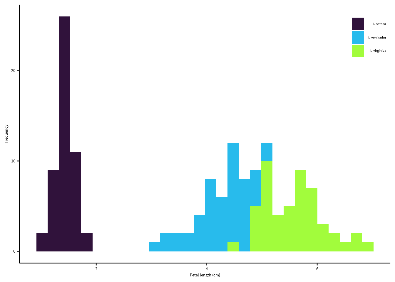
ヒストグラム
= "Petal length (cm)" = "Frequency" |> ggplot () + geom_histogram (aes (x = Petal.Length, fill = Species)) + scale_x_continuous (name = xlabel) + scale_y_continuous (name = ylabel) + scale_fill_viridis_d ("" , option = "turbo" , begin = 0 , end = 0.5 , labels = scales:: parse_format ()) + theme_pubr (base_family = "notosans" ) + theme (text = element_text (size = 10 ),legend.position = c (1 ,1 ),legend.justification = c (1 ,1 ))
`stat_bin()` using `bins = 30`. Pick better value with `binwidth`.
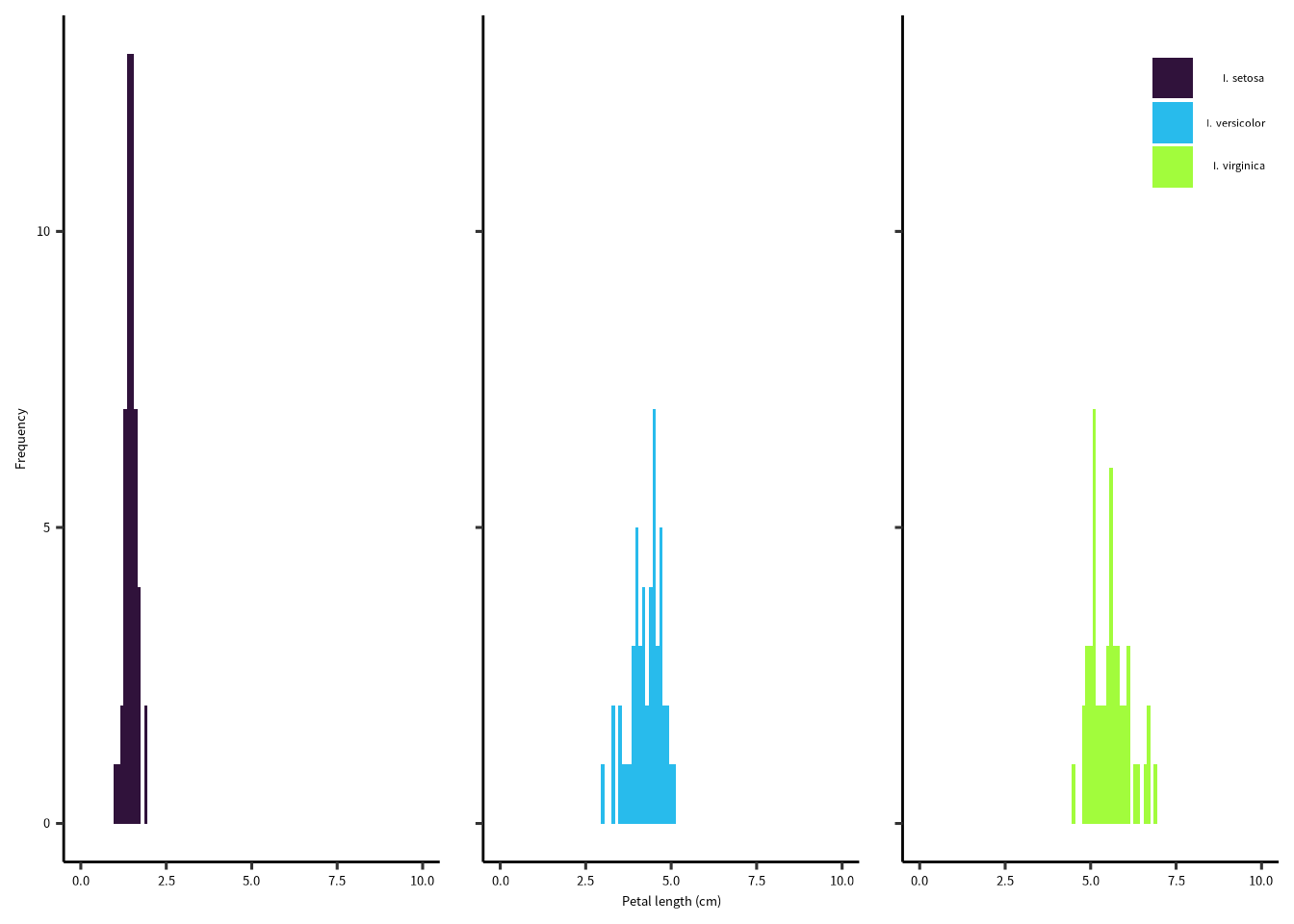
ヒストグラム・パネル
= "Petal length (cm)" = "Frequency" |> ggplot () + geom_histogram (aes (x = Petal.Length, fill = Species),binwidth = 0.1 , center = 0 ) + scale_x_continuous (name = xlabel, limits = c (0 , 10 )) + scale_y_continuous (name = ylabel) + scale_fill_viridis_d ("" , option = "turbo" , begin = 0 , end = 0.5 , labels = scales:: parse_format ()) + facet_rep_wrap (facets = vars (Species)) + theme_pubr (base_family = "notosans" ) + theme (text = element_text (size = 10 ),legend.position = c (1 ,1 ),legend.justification = c (1 ,1 ),strip.background = element_blank (),strip.text = element_blank ())
Warning: Removed 6 rows containing missing values (`geom_bar()`).
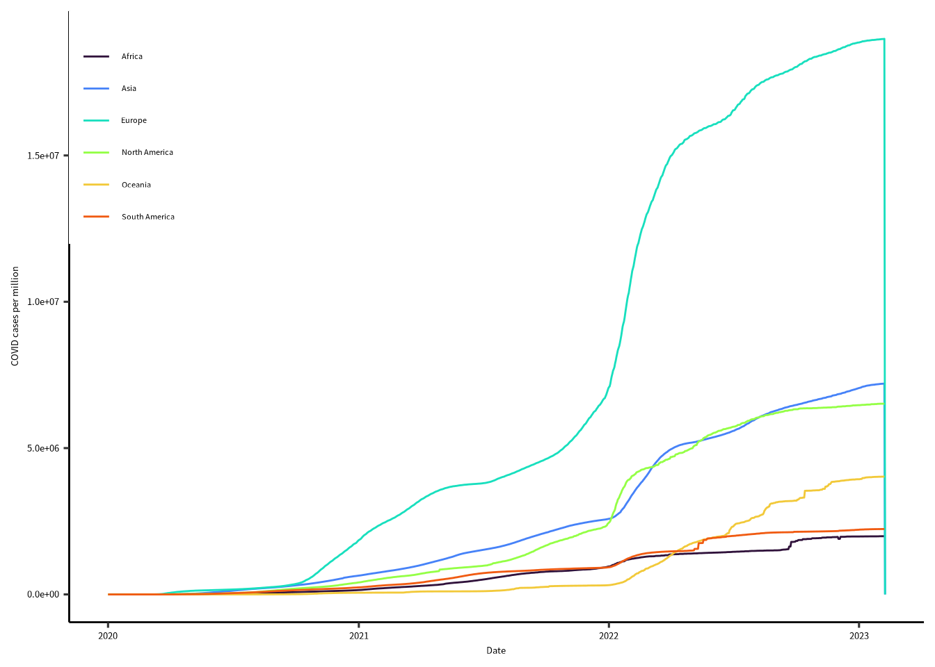
時系列
データは (https://covid.ourworldindata.org/data/owid-covid-data.csv)。
= read_csv ("https://covid.ourworldindata.org/data/owid-covid-data.csv" )
Rows: 255834 Columns: 67
── Column specification ────────────────────────────────────────────────────────
Delimiter: ","
chr   (4): iso_code, continent, location, tests_units
dbl  (62): total_cases, new_cases, new_cases_smoothed, total_deaths, new_dea...
date  (1): date

ℹ Use `spec()` to retrieve the full column specification for this data.
ℹ Specify the column types or set `show_col_types = FALSE` to quiet this message.
= covid |> group_by (continent, date) |> summarise (tc = sum (total_cases_per_million, na.rm= T),td = sum (total_deaths_per_million, na.rm= T)) |> drop_na ()
`summarise()` has grouped output by 'continent'. You can override using the
`.groups` argument.
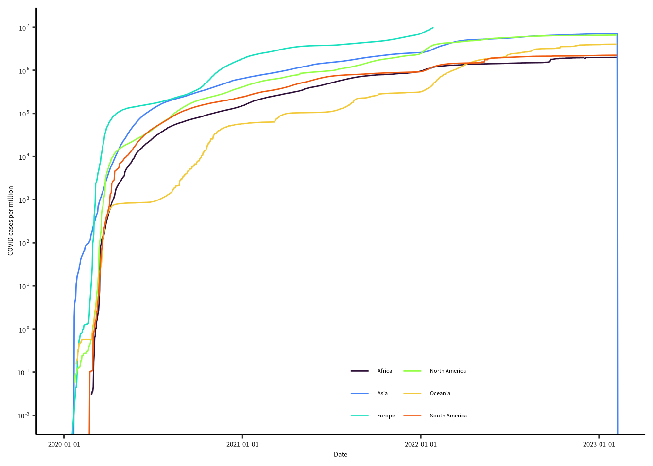
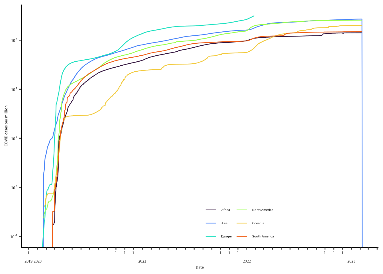
= "Date" = "COVID cases per million" ggplot (covid2) + geom_path (aes (x= date, y = tc, color = continent))+ scale_x_date (name = xlabel) + scale_y_continuous (name = ylabel) + scale_color_viridis_d ("" , option = "turbo" , begin = 0 , end = 0.8 ) + theme_pubr (base_family = "notosans" ) + theme (text = element_text (size = 10 ),legend.position = c (0 ,1 ),legend.justification = c (0 ,1 ),strip.background = element_blank (),strip.text = element_blank ())
時系列
= "Date" = "COVID cases per million" ggplot (covid2) + geom_path (aes (x= date, y = tc, color = continent))+ scale_x_date (name = xlabel, date_labels = "%Y-%m-%d" ) + scale_y_continuous (name = ylabel, breaks = 10 ^ seq (- 2 ,7 ), limits = c (0.01 , 10 ^ 7 ),trans = "log10" , labels = scales:: label_math (format = log10)) + scale_color_viridis_d ("" , option = "turbo" , begin = 0 , end = 0.8 ) + guides (color = guide_legend (ncol = 2 )) + theme_pubr (base_family = "notosans" ) + theme (text = element_text (size = 10 ),legend.position = c (0.5 ,0 ),legend.justification = c (0 ,0 ),legend.background = element_blank (),strip.background = element_blank (),strip.text = element_blank ())
Warning: Transformation introduced infinite values in continuous y-axis
時系列軸のカスタムラベル
= function () {function (x) {= format (x, "%b" )= str_sub (m, start = 1 , end = 1 )= format (x, "%Y" )ifelse (duplicated (y), m, sprintf ("%s \n %s" , m,y))
時系列
= "Date" = "COVID cases per million" ggplot (covid2) + geom_path (aes (x= date, y = tc, color = continent))+ scale_x_date (name = xlabel, date_breaks = "months" , labels = gnn_date ()) + scale_y_continuous (name = ylabel, breaks = 10 ^ seq (- 2 ,7 , by = 2 ), limits = c (0.01 , 10 ^ 7 ),trans = "log10" , labels = scales:: label_math (format = log10)) + scale_color_viridis_d ("" , option = "turbo" , begin = 0 , end = 0.8 ) + guides (color = guide_legend (ncol = 2 )) + theme_pubr (base_family = "notosans" ) + theme (text = element_text (size = 10 ),legend.position = c (0.5 ,0 ),legend.justification = c (0 ,0 ),legend.background = element_blank (),strip.background = element_blank (),strip.text = element_blank ())
Warning: Transformation introduced infinite values in continuous y-axis
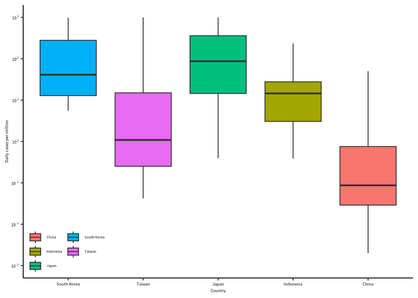
箱ひげ図
= covid |> filter (date >= lubridate:: ymd ("2021-01-01" )) |> filter (str_detect (location, "Indonesia|Japan|South Korea|Taiwan|China" ))
= "Country" = "Daily cases per million" ggplot (covid2) + geom_boxplot (aes (x = fct_reorder (location, new_cases_per_million, mean, na.rm= T, .desc= T), y = new_cases_per_million, fill = location)) + scale_x_discrete (name = xlabel) + scale_y_continuous (name = ylabel, breaks = 10 ^ seq (- 3 ,3 , by = 1 ), limits = 10 ^ c (- 3 , 3 ),trans = "log10" , labels = scales:: label_math (format = log10)) + scale_color_viridis_d ("" , option = "turbo" , begin = 0 , end = 0.8 ) + guides (fill = guide_legend (ncol = 2 )) + theme_pubr (base_family = "notosans" ) + theme (text = element_text (size = 10 ),legend.position = c (0 ,0 ),legend.justification = c (0 ,0 ),legend.background = element_blank (),legend.title = element_blank (),strip.background = element_blank (),strip.text = element_blank ())
Warning: Transformation introduced infinite values in continuous y-axis
Warning: Removed 506 rows containing non-finite values (`stat_boxplot()`).