研究室の図を評価化してほしいので次のコードを紹介します。 ではパッケージの読み込みと作図環境を整えましょう。
Load packages
── Attaching core tidyverse packages ──────────────────────── tidyverse 2.0.0 ──
✔ dplyr     1.1.4     ✔ readr     2.1.5
✔ forcats   1.0.0     ✔ stringr   1.5.1
✔ ggplot2   3.5.1     ✔ tibble    3.2.1
✔ lubridate 1.9.3     ✔ tidyr     1.3.1
✔ purrr     1.0.2
── Conflicts ────────────────────────────────────────── tidyverse_conflicts() ──
✖ purrr::%||%()   masks base::%||%()
✖ dplyr::filter() masks stats::filter()
✖ dplyr::lag()    masks stats::lag()
ℹ Use the conflicted package (<http://conflicted.r-lib.org/>) to force all conflicts to become errors
library (lubridate)library (patchwork)library (ggpubr)library (ggtext)library (lemon)
Attaching package: 'lemon'

The following object is masked from 'package:purrr':

    %||%

The following object is masked from 'package:base':

    %||%
library (ggrepel)library (showtext)
Loading required package: sysfonts
Loading required package: showtextdb
Linking to ImageMagick 6.9.11.60
Enabled features: fontconfig, freetype, fftw, heic, lcms, pango, webp, x11
Disabled features: cairo, ghostscript, raw, rsvg
Using 32 threads
これで Google fonts からフォントをダウンロードできます。 このとき、ネットへつなげる必要があります。 Noto Sans は英語のフォントですが、 Noto Sans JP は日本語のフォントです。 図に日本語を入れたい場合は、日本語フォントの読み込みが必要です。
font_add_google (name = "Noto Sans" ,family = "notosans" )font_add_google (name = "Noto Sans JP" ,family = "notosansjp" )
フォントを読み込んだら、図のデフォルトの設定を変えます。 ここでは ggpubr のパッケージから theme_pubr() をデフォルト に設定しますが、そのときに、 フォントサイズ base_size と 使用するフォント base_family を していします。 theme_set() はデフォルトテーマ設定用関数です。
theme_pubr (base_size = 12 ,base_family = "notosans" ) |> theme_set ()
次に theme_pubr() をちょっとだけ修正します。 図の背景を白に設定し、図に黒い枠をつけます。 黒い枠を追加したので、軸の線を外します。 凡例の背景とタイトルも外します。
theme_pubr () |> theme_replace (panel.background = element_rect (fill = "white" ,color = "black" ,linewidth = 1 axis.line = element_blank (),legend.background = element_blank (),legend.title = element_blank ()
テーマの設定を適応するためには、次のコードを実行します。
データの読み込み
今回の図は形上湾の予備データを用います。 データは研究室のサーバにあるので、次のようコードを実行して、 データを読み込みましょう。 read_rds() の後の print() は読み込んだデータの最初の3行を コンソールに表示するために追加したが、なくてもいいです。
= "~/Lab_Data/standardized_figures/allcarbondata.rds" = read_rds (fname) |> print (n = 3 )
# A tibble: 107 × 8
  Core_length   LOI Mapping  Type    dry_mud    OC carbon_density carbon_content
        <dbl> <dbl> <chr>    <chr>     <dbl> <dbl>          <dbl>          <dbl>
1        52.5  7.97 Seagrass Seagra…    29.6  2.38         0.0171          0.704
2        52.5  9.43 Seagrass Seagra…    30.3  2.94         0.0217          0.890
3        52.5  7.29 Seagrass Seagra…    30.9  2.13         0.0160          0.658
# ℹ 104 more rows
作図例その 1
図の軸にはタイトルと関係する単位を必ず追加しましょう。 もっと合理的な方法として、軸タイトルのオブジェクトをつくことです。 ここでは、xlabel と ylabel のオブジェクトを作りました。 x 軸に当てた変数には単位はありません。 でも、y 軸の変数には単位が必要です。
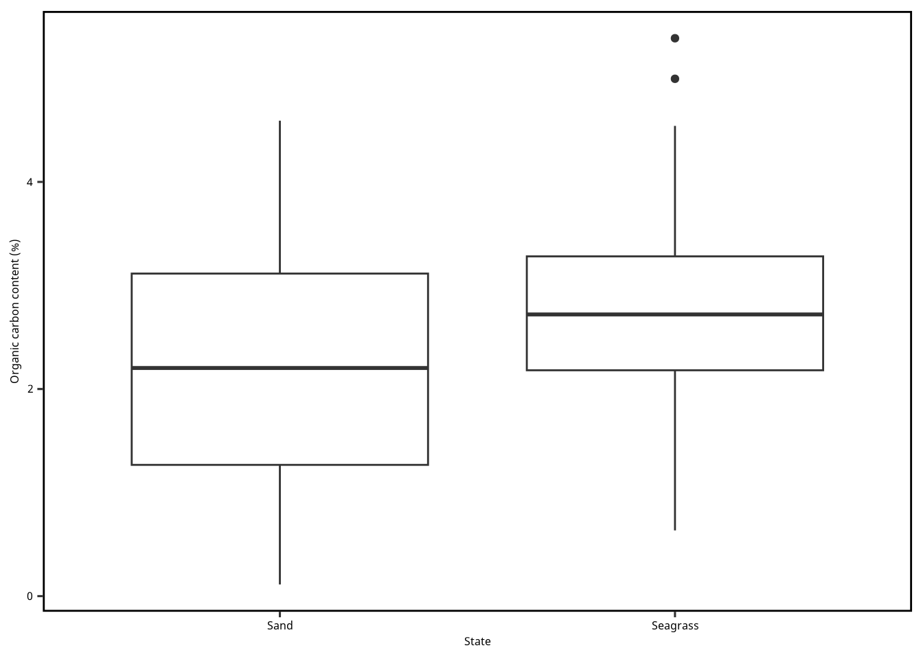
まずは箱ひげ図を作ります。 ところが Figure 1 の見た目がわるい。 y 軸に範囲を調整して、全てのデータを囲むようにしましょう。 2群のデータしかないので、わざわざいろで分ける必要はないですが、 せっかくなので、色分けもしましょう (Figure 2 )。
= "State" = "Organic carbon content (%)" ggplot () + geom_boxplot (aes (x = Mapping,y = OC,data = dset+ scale_x_discrete (name = xlabel) + scale_y_continuous (name = ylabel)
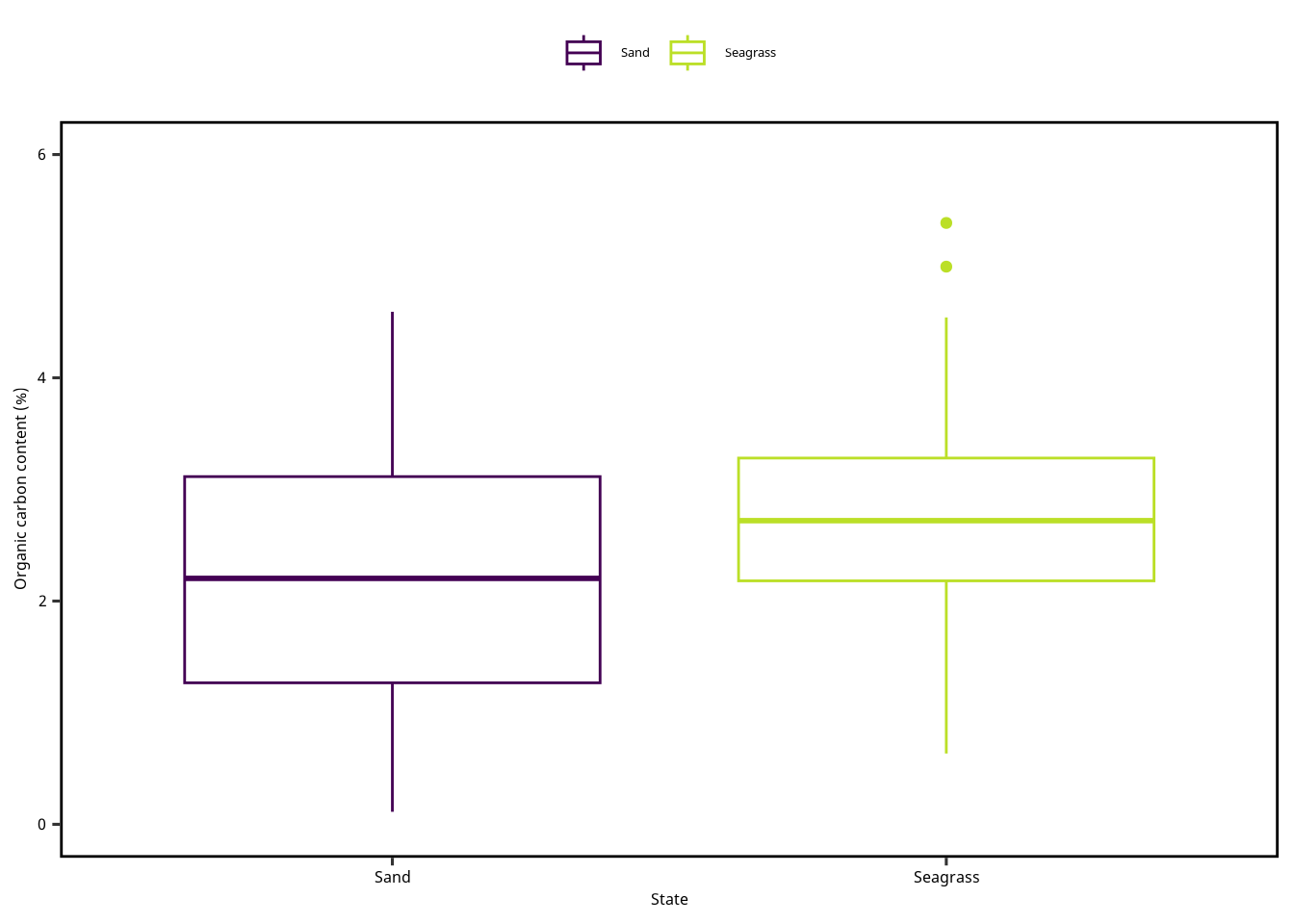
ここで Figure 1 を修正しました。 軸と凡例が重複しているので、どちらかを外してもいいとおもいます。
= "State" = "Organic carbon content (%)" = c (0 , 6 )ggplot () + geom_boxplot (aes (x = Mapping,y = OC,color = Mappingdata = dset+ scale_x_discrete (name = xlabel) + scale_y_continuous (name = ylabel, limits = ylimits) + scale_color_viridis_d (end = 0.9 )
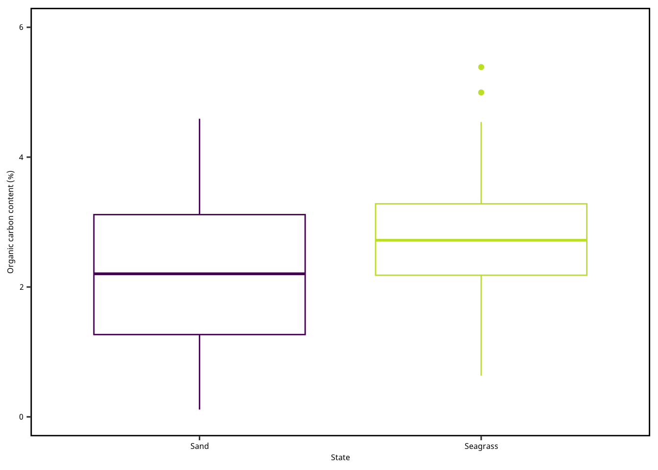
Figure 3 は Figure 2 から凡例を外しました。 geom_boxplot() に show.legend = F を渡せば、 その geom の凡例を隠すようにできます。
= "State" = "Organic carbon content (%)" = c (0 , 6 )ggplot () + geom_boxplot (aes (x = Mapping,y = OC,color = Mappingdata = dset,show.legend = F+ scale_x_discrete (name = xlabel) + scale_y_continuous (name = ylabel, limits = ylimits) + scale_color_viridis_d (end = 0.9 )
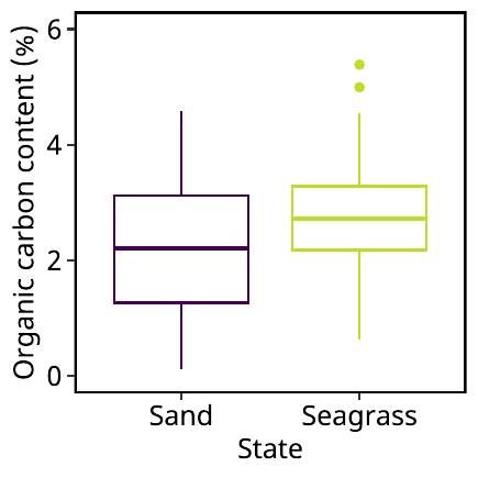
では Figure 3 が完成したので、この図をファイルに保存します。 ここで重要なのは保存方法です。 できる限りフォントの大きさを変えずに図を保存しましょう。
最もいい方法は、pdf ファイルへの保存です。 その後、png ファイルに変換すれば、とても整った使いやすい 画像ができあがります。
まず保存したい図をオブジェクトに書き込みます。 この図は plot1 にいれました。
= "State" = "Organic carbon content (%)" = c (0 , 6 )= ggplot () + geom_boxplot (aes (x = Mapping,y = OC,color = Mapping),data = dset,show.legend = F) + scale_x_discrete (name = xlabel) + scale_y_continuous (name = ylabel, limits = ylimits) + scale_color_viridis_d (end = 0.9 )
保存先のファイル名を指定します。
= "figure01.pdf" = str_replace (pdfname, "pdf" , "png" )
次に図の寸法を指定します。 研究室用パッケージ gnnlab に aseries() の関数があります。 この関数は A判の用紙サイズの寸法を返してくれます。
例えば A4 なら次のように関数をつかいます。
レポートなどを作るなら、A7 (74 mm × 105 mm) はちょうどいいサイズです。 まず、PDF ファイルとして保存します。
= gnnlab:: aseries (7 )ggsave (filename = pdfname, plot = plot1,width = wh[1 ],height = wh[1 ],units = "mm" )
その次に、PDF ファイルを PNG ファイルに変換します。 このとき、PDF ファイルを読み込んだときに、解像度を指定できます。 デフォルトは density = 300 ですが、もしも density = 150 の PNG ファイルに保存したいのであれば、次のように実行しましょう。
image_read_pdf (pdfname, density = 150 ) |> image_write (pngname)
作図その 2
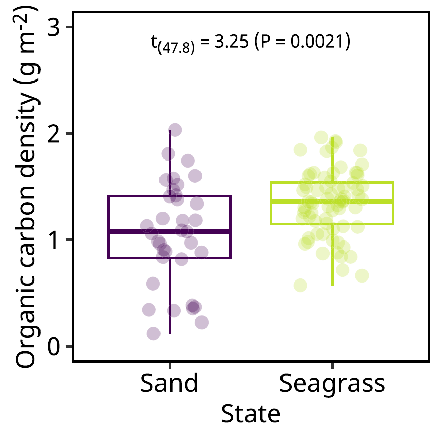
図に特殊な記号や文字の書式を工夫したいなら、ggtext のパッケージをつかいましょう。 次の図は 有機炭素の面積あたりの量とその t 検定の結果を示す図を作ります。
軽いデータ処理をします。
= dset |> mutate (ccm2 = carbon_content / ((1.5 / 100 )^ 2 * pi)) |> mutate (ccm2 = ccm2 / 1000 )
次は t 検定を実施します。
t.test (ccm2 ~ Mapping, data = dset)
    Welch Two Sample t-test

data:  ccm2 by Mapping
t = -3.2519, df = 47.81, p-value = 0.002105
alternative hypothesis: true difference in means between group Sand and group Seagrass is not equal to 0
95 percent confidence interval:
 -0.4762400 -0.1123041
sample estimates:
    mean in group Sand mean in group Seagrass
              1.050607               1.344879
t検定の結果を後で使いたいので、次のように結果を tibble 化をします。
= t.test (ccm2 ~ Mapping, data = dset) |> :: tidy () |> print ()
# A tibble: 1 × 10
  estimate estimate1 estimate2 statistic p.value parameter conf.low conf.high
     <dbl>     <dbl>     <dbl>     <dbl>   <dbl>     <dbl>    <dbl>     <dbl>
1   -0.294      1.05      1.34     -3.25 0.00211      47.8   -0.476    -0.112
# ℹ 2 more variables: method <chr>, alternative <chr>
t 検定の結果の文字列を作って、tibble にします。
= sprintf ("t<sub>(%0.1f)</sub> = %0.2f (P = %0.4f)" ,$ parameter,abs (tout$ statistic),$ p.value) |> print ()
[1] "t<sub>(47.8)</sub> = 3.25 (P = 0.0021)"
= tibble (x = "Seagrass" ,y = 3 ,l = textout)
sprintf() は文字列を出力するための関数ですが、変数を渡して 他の文字列と組み合わせることができます。 このとき % と変換指定子を使って書式の設定をします。
構造は次のよう通りです: %(フラグ)(フィールド幅.精度)変換指定子
フラグ
- 左詰め(デフォルトは右詰め)+ 符号付き(デフォルトは負のときのみ)0 フィールド幅未満の場合はゼロで埋める()
変更指定子
ちなみに % を出力したいときは、 %% を記述しましょう。
= "State" = "Organic carbon density (g m<sup>-2</sup>)" = ggplot () + geom_boxplot (aes (x = Mapping,y = ccm2,color = Mappingdata = dset,show.legend = F+ geom_point (aes (x = Mapping,y = ccm2,fill = Mappingdata = dset,shape = 21 ,size = 3 ,alpha = 0.25 ,stroke = 0.1 ,color = "white" ,position = position_jitter (0.2 ),show.legend = F+ geom_richtext (aes (x = x, y = y,label = ldata = textdf1,family = "notosans" ,color = "transparent" ,fill = "transparent" ,text.color = "black" ,size = 3 , nudge_x = - 0.5 ,vjust = 1 ,hjust = 0.5 + scale_x_discrete (name = xlabel) + scale_y_continuous (name = ylabel,limits = c (0 , 3 )) + scale_color_viridis_d (end = 0.9 ) + scale_fill_viridis_d (end = 0.9 ) + theme (axis.title.y = element_markdown ()
ggtext パッケージを読み込めば、 ggplot に markdown, HTML, CSS の一部の機能を使えます。 ここでは文字を上付きや下付きにするために使っています。
下付き CO<sub>2</sub> は CO2 になります。
上付き m<sup>-2</sup> は m-2 になります。
イタリック体 <i>Sargassum horneri</i> は Sargassum horneri
改行は <br> のタグでできます。
図を保存して、解像度 300 で読みここ見ます。
= "figure02.pdf" = str_replace (pdfname, "pdf" , "png" ):: aseries (4 ) # A4 サイズ = gnnlab:: aseries (7 )ggsave (filename = pdfname, plot = plot2,width = wh[1 ],height = wh[1 ],units = "mm" )image_read_pdf (pdfname, density = 300 ) |> image_write (pngname)
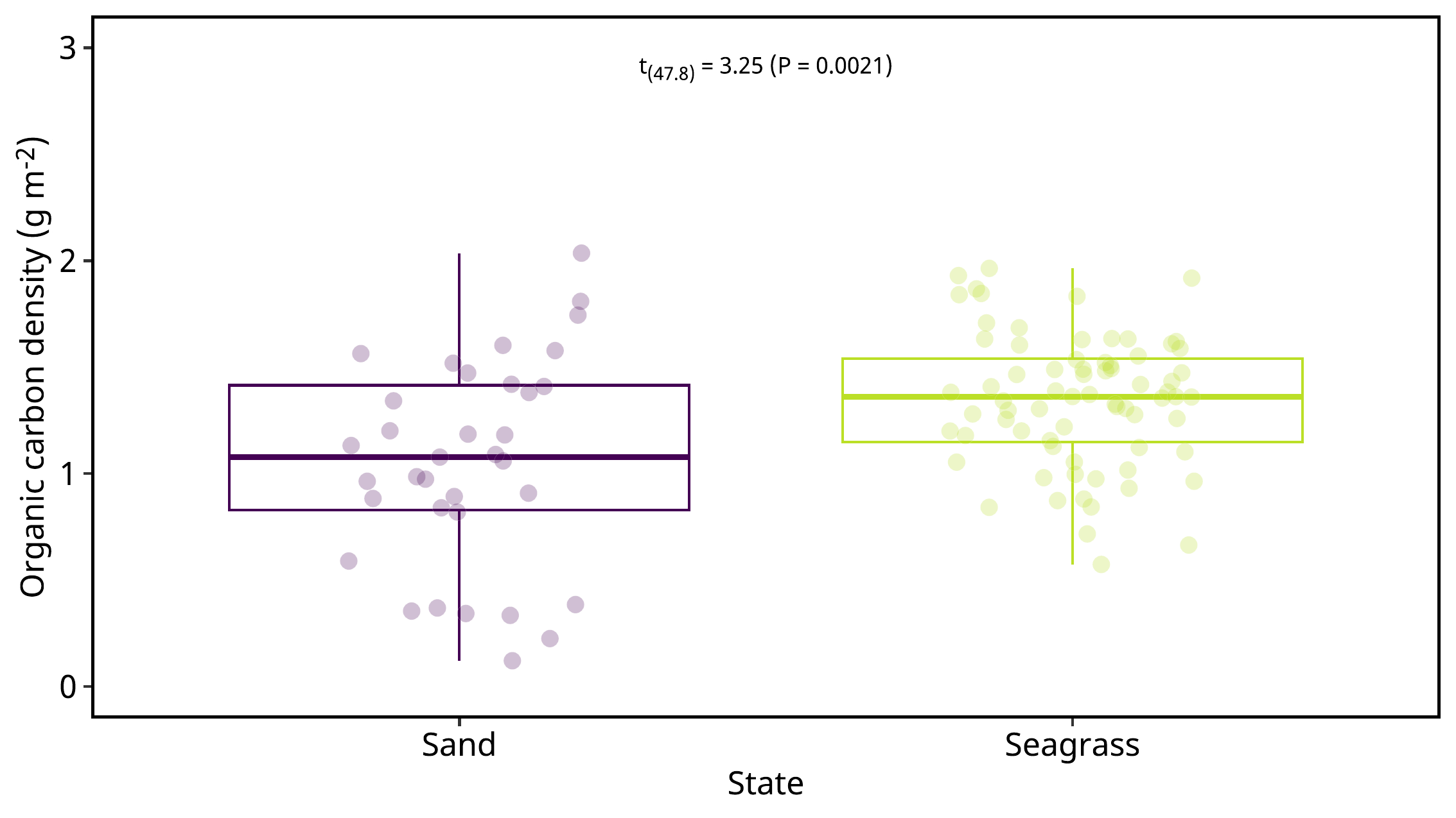
図を発表スライドに合わせたいなら、wh = c(192.0, 108.0) にします、
= "figure03.pdf" = str_replace (pdfname, "pdf" , "png" )= c (192.0 , 108 ,0 )ggsave (filename = pdfname, plot = plot2,width = wh[1 ],height = wh[2 ],units = "mm" )image_read_pdf (pdfname, density = 300 ) |> image_write (pngname)
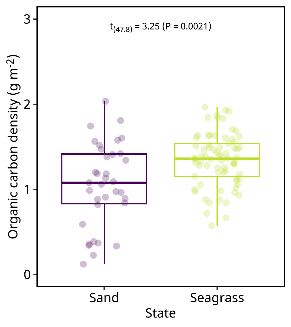
スライドの半面に合わせた図。
= "figure04.pdf" = str_replace (pdfname, "pdf" , "png" )= c (192.0 , 108 ,0 )ggsave (filename = pdfname, plot = plot2,width = wh[1 ]/ 2 ,height = wh[2 ],units = "mm" )image_read_pdf (pdfname, density = 300 ) |> image_write (pngname)